Ah, I am terrible aren't I? After posting my last post on photography, which was in April this year, I had all intents on doing more photography posts…but then you keep eating out…and then you get caught in the undertow of a backlog of posts to get up. Then there's that life thing.
But I shouldn't be making excuses!

In my last photography related post, one question did come up about something I touched on very briefly, which I thought I might elaborate on a little more. What is the rule of thirds? Which I have decided to expand on, and talk about composition in general.
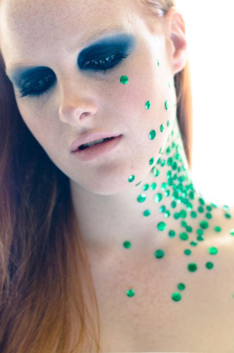 (I loved shooting this concept but wish I had more sequins still...MOAR!)
A year or two ago, I did some portrait photography sessions, both as a model and a photographer and it was always interesting to see what photos people ended up with of the same subject, and how some stood out to me as being 'better' shots, even though the setup for the most part was the same. Of course 'better' is all pretty subjective, but hear me out here.
Whilst many elements are involved in making a good picture (light, colour etc.), one of my focuses is on composition. Composition is basically how you frame or arrange the subject of your image in the photo, ideally, this would be to make your photo look as appealing as possible to most people's eyes. Now I don't know all the science and why the magic grid I will discuss later works and stuff…but it just works. Y'know? And it's not just for food photography, or even just photography, but for all things that need to look visually pleasing.
I think for me, I've spent a lot of my life immersing myself in visual graphic stuff (as I've always just kind of assumed I'm not so academically gifted), so drawing, communication and multimedia design, and as such composition comes to me quite naturally. Some people will have a knack for it, but some will need to consciously take the time to practice until it becomes so natural. It's like driving, you don't have to think about how you drive a car, you just do it kind of subconsciously.
So here a couple of points I would give if someone were to ask me for some tips. As I've always said, I'm no expert and I'm always personally trying to improve and feel like my photos tend to get a bit same same since I'm so comfortable in my formulas, but it's better to share than not right?
I'll try to relate a couple of tips more specifically to food photos as well, although it really can be applied to anything, and I've tried to gather all sorts of pictures to demonstrate my points...although admittedly, it was kind of hard to look for or make 'bad' examples as I feel like I'm so naturally concious of it. Or maybe I'm just really not that modest. Or something. Y'know.
HAIL THE ALMIGHTY RULE OF THIRDS GRID
What is the rule of thirds?
It's pretty simple.
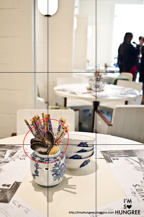
Imagine a grid like the one on the image above, on your viewfinder or image, so that you have a 3x3 grid. Where the lines cross, should be where the feature or focal point of your photograph is, or at the very least, it should be sitting along one of the lines. As I said, I don't know exactly the science behind it, but it creates a more pleasant tension in the photo for the eye to follow. As a bit of an artsy fartsy person, I feel like it gives the photo more room to breathe, when a photo is dead centre, it often feels like it has nowhere to go and feels a bit stuffy. Of course there are exceptions to the rule and there are many beautiful shots which are dead centre, but the rule of thirds almost never fails when used. Or as far as I know...

Here's me attempting to make a bad example for you. Not the best example, but in the first shot, the bite in the burrito is centered. It's awkward. To me anyway. It wouldn't be sitting on any of the lines in the grid. And I know to most of you, you're thinking "But you should put the whole burrito in the image!", but believe me, I've seen some people, that when shooting, are so focussed on one aspect that they tend to forget everything else in the photo. Boggles my mind.
But anyway, move the bite mark over a little bit...and there we go! Much easier to look at and more engaging with the viewer...and guess what, if I drew a grid on that, you'd find it be on one of the rule of third lines!
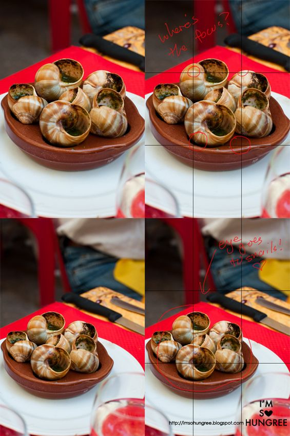
Again, not the best example and for some people, the top image may look better, but for me, I don't know which snail shell to look at. In the second picture, I'm immediately drawn to the one at the very front, since it's right in the intersection of two of the lines.
I DON'T CARE I WANT MY IMAGE IN THE MIDDLE! YOU DON'T KNOW ANYTHING HUNGREE ASHLEY! /ENDRAGE
Well okay, don't take my advice then! No one asked you to! I know you don't love me! ;____;
Ahem. If you do want a photo where you're shooting the object right in the middle of the frame, I'd suggest playing up symmetry. It generally keeps the photo a lot neater and easier for the eye to follow and offers less distractions and interruptions.
CHOP CHOP!
I tend to shoot wide, so I have the option to crop the image (especially since I shoot in RAW), and make my composition later. Got to love the options that post-processing give you. But even when I do shoot wide, I'm still watching where everything's placed!
(The above two photos did not come from the same picture. But I hope you get what I mean anyway though.)
YOUR FOOD IS ALIVE. IT NEEDS TO BREATHE.
I touched on this on the rule of thirds, but let the food in your image 'breathe'. I like, personally adore negative space, which is just empty space or background, usually above the dish or to the side, which isn't filled with things for the eye to look at, which means the eye is more drawn to the main subject. It just opens up the photo overall.
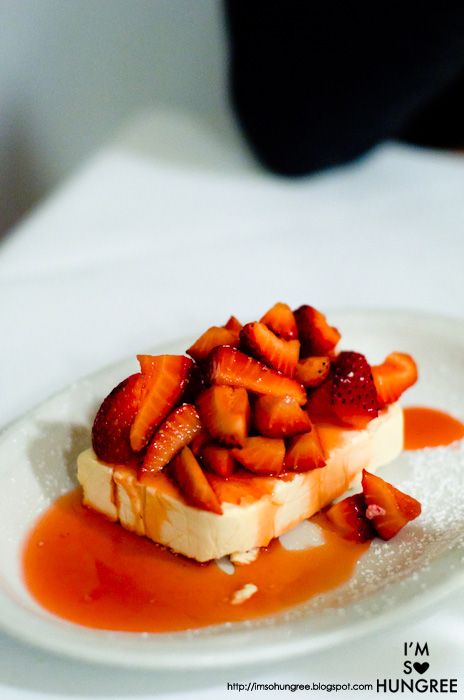
There are many ways you can let your image 'breathe', and again, it relates back to the rule of thirds. Put the plate, or protein on your plate on one of the lines, and it will almost instantly have breathing room and generally be a bit softer and easier to look at.
As you can see for portrait type shots, I tend to let the dish sit on the lower third line. To me, it just generally seems more luxurious and soothing on the eyes. We naturally read pages from top to bottom, so why not images? You may as well finish the image on a sexy looking note, rather than starting with something nice and ending with nothing, no?

But having said that, you may as well try it out anyway and see what you like! I'm just giving you guys my preferences. My photos tend to use the same formula, but it's hard to go past something that's worked so well for so long right?
GO WITH THE FLOW BRO
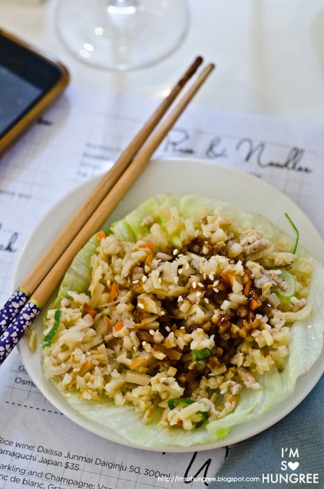
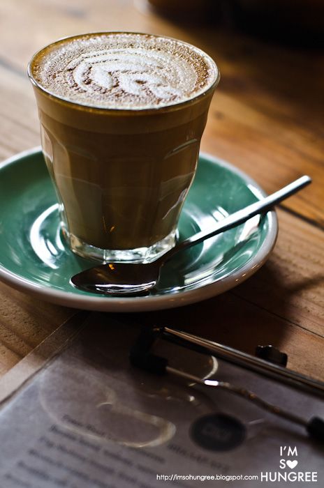
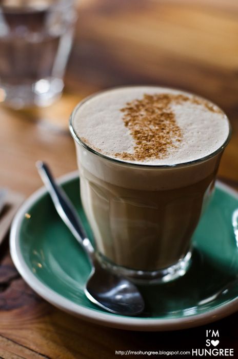
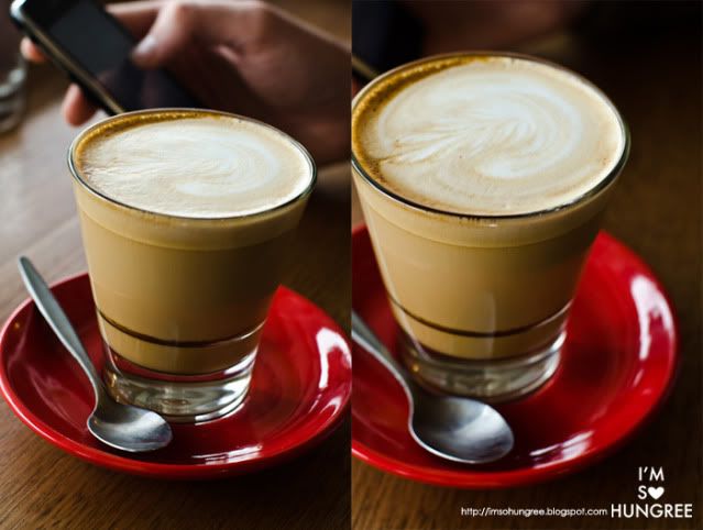
Once you've picked your focal point and found a nice spot for it, keep an eye out for flowing elements. When I'm eating out, this can be the cutlery, the sauce smear on a plate etc. You want it to all have a nice 'alignment' and if it can be aligned with the rule of thirds…even better!
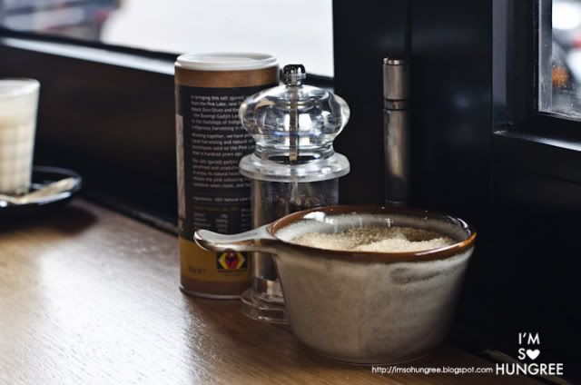
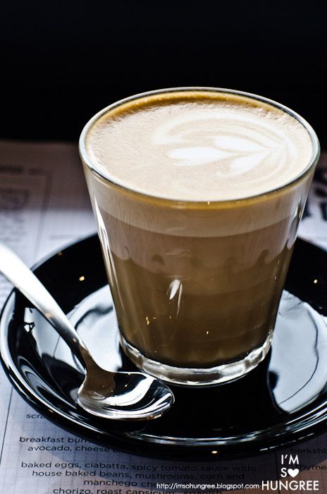
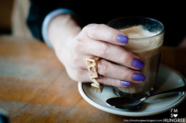
I've developed a bit of a habit when shooting coffee cups, to make sure that the spoon is around the side of the cup, it gives it a nice angle rather than if it was behind the cup. (Refer to earlier coffee photo to see what I like...)
MAN, THAT'S LIKE DEEP Y'KNOW?

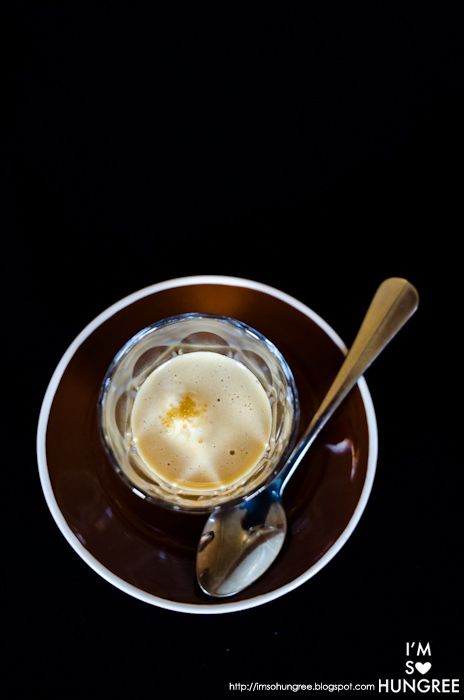
If you're using a DSLR and have a fondness for shallow apertures like me, don't get lazy with your focal point. Make sure that the point that is most focussed, is near an intersection of the grid of a third line. Otherwise it just has a tendency to look a bit messy. I love playing with this as it can change the mood of a photo completely!
BREAK THE MIRRORS
I'm a fan of asymmetry in general. It's actually pretty easy to do this using the rule of thirds grid too.
Try this little exercise first actually. If I tell you to make a frame with your fingers, like you're an artist sizing up your model, you (should) instinctively put your fingers something like this...
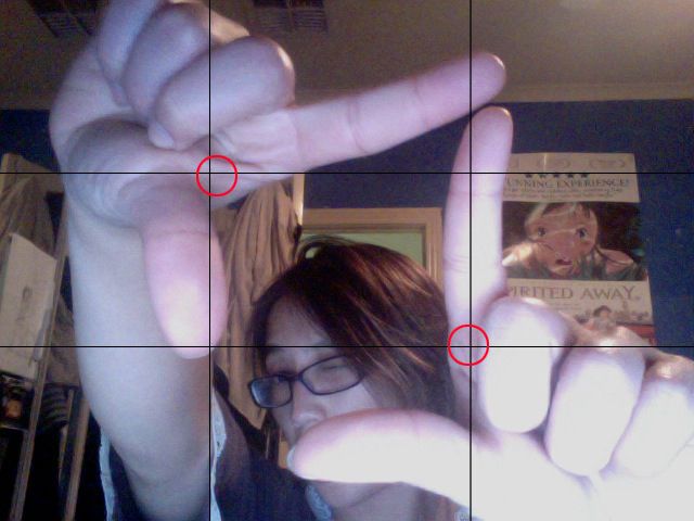
Ta-dah! Frame! Grid! Admittedly not the best photo (which I haven't managed to take with proper composition), but I hope you get what you mean.
So just do the same with your photos. Look for frames in the objects you're shooting.

See here? Asymmetry, the areas I want people to focus on are opposite each other diagonally!
THE ONLY RULE IS...THERE ARE NO RULES
Wait, but didn't I say earlier something about obeying the magic rule of thirds...rule?
Well yah, this is true, but you're never going to learn unless you try taking lots of photos in lots of different ways. If you have lots of angles and framings of the same subject, then you can get an idea of what works and what doesn't work. If you only stick to following the rules, you won't really see the flipside right? And again, what makes a 'good' photo is incredibly subjective, so build up your own style over time.
I could really keep going on and find more examples and attempt to awkwardly explain how I frame my shots, but you're probably bored of reading my ramblings...so hurry up grab your camera and go shoot!
Anything else photography related you think I should talk about? Would love to hear your ideas!